Friday, April 30, 2010

Travels on Tropic Moon


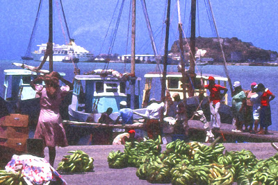
My husband and I lived on Tropic Moon, a 42-foot sailboat, from 1978-1992. We took a lot of slides during that time. As I study and practice more with Photoshop, it occurred to me that our slides would be a good source of images for me to work with. And, fortunately, I have a scanner that scans slides. The first picture was taken at St. John's Harbor, Antigua, in the Caribbean (early 1980's). Lots of bananas for sale!
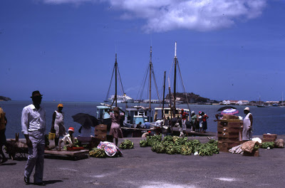
This is the original slide I used. I started by cropping a section of the picture, and then altering it in Photoshop.
This next picture was taken on Mikonos, one of the Greek islands, probably in 1987.
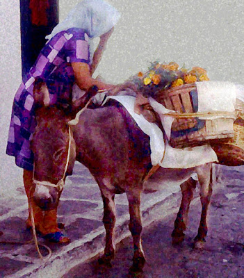
(Said the donkey: If we both keep our eyes closed, maybe they won't be able to see us!)
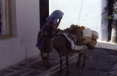
Here's the original slide. While the slides looked good when viewed with a slide projector and shown on a white screen, most of the slides scanned really dark. They were much more difficult to work with than the pictures I take with my digital camera. There were also strange spots on some of the images that I first thought might be deterioration in the slides. (Note to self: Dust and clean the glass plate on scanner before scanning more slides....)

Friday, April 23, 2010

Azalea Bushes


In Photoshop, I used the sponge filter. I also - accidently - changed the proportions of the image and decided I liked it. (The bushes got taller....) Please click on the image to see the painterly effect. Below is the original photo.
This was taken in my neighbor's yard.

Thursday, April 22, 2010

Wednesday, April 21, 2010

Wednesday's Work - Afghan #4 Completed


I finished this one yesterday, including sewing in all the loose ends, and crocheting around the edge. I like the bright colors!

Stretched out on the floor.

Simon Schuster posing on the afghan.

This was the pile of yarn before I started this afghan. I didn't buy any new yarn.

This is the pile after I finished the afghan. Still seems to be quite a bit there, though not enough for another afghan.

Monday, April 19, 2010

Photo Challenge


(Tree Stump)
Spring is dazzingly beautiful in this part of the world. Flowering trees and shrubs add such vibrant color to the area that it's hard to know where to look first. I've taken lots of photos of flowers this spring. I even went to the garden center at Lowe's Home Improvement and took pictures of their flowers. And I decided that I've (temporarily) reached "flower overload."

(Pond)
So when I went for an early morning walk on the neighboring golf course, I set myself the challenge of taking pictures of things that weren't flowers.

(Weed)
Even though I was walking on a golf course, I like taking photos that have nothing to do with golf. I don't golf.

(Green Pond Scum)
There was no shortage of photo opportunities.

(Dead Pine Needles)
Back home, when I was processing my photos in Photoshop, I decided to give my buddy, The Sponge Filter, a go at the images. I liked the results better than the straight photos, so that's what you're seeing here.

(Bird in a Tree)
This bird posed for me, and after I got a couple shots, it flew away.

(Blue Netting)
No idea what they were using the netting for - it was in a heaping big pile.

(Cloudy Sky)
Happy Days!

Saturday, April 17, 2010

Introducing Iris


I had never seen this color of iris before - it was sort of pale brown, or mauve.

There were at least a dozen of the flowers in a flower bed in front of the History Place, a local museum.

So glad I had my camera with me!

The Letter W - Illustrated


Waiting

Warning

Watchful

Watercolor

Waterfront

Wavy Window

Friday, April 16, 2010

Spring Color Wheel


I used some of my photos of flowers to put this wheel together.

Wednesday, April 14, 2010

Wednesday's Work - Almost There!


The afghan I showed last week is almost done. I have one & a half rows of hexagons left on the length. Then there's crocheting to fill in the indentations on both sides of the afghan.

Here's the back of the afghan. You can see there'll be a few loose ends to sew in.

There's still quite a bit of yarn left too. Hmm....

Tuesday, April 13, 2010

Playground


I came upon this playground the other day when I was wandering around Morehead City looking for structures to photograph.

It was pretty impressive and, though I managed to leave most of the people out of my pictures, there were lots of people enjoying themselves.

This fellow looks like he could have used a hand!

Now for my playtime. This image used Photoshop's poster edges filter.

I got a little carried away with this image, and have no idea which filters I used, but there were a lot of them! Weird, but I like it.

For this last image I used "poster edges" and "hue/saturation." Kind of medieval-looking, me thinks....

Monday, April 12, 2010

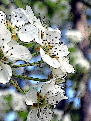
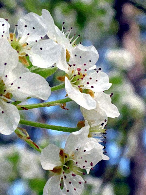
Pear Blossoms


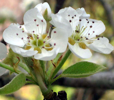
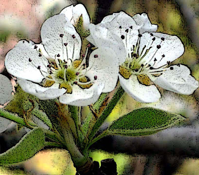
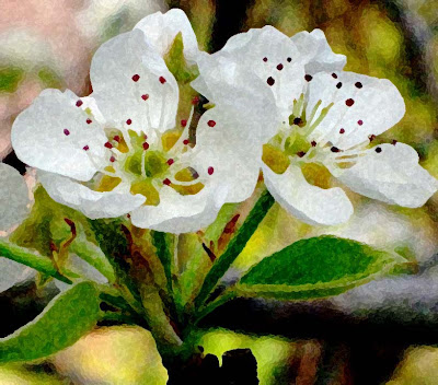
Springtime brings such beautiful flowers! And they all seem to be posing to have their pictures taken. I was practicing with Photoshop filters and decided to try "poster edges" and "sponge filter" on a couple of images.

This shows the first picture after I applied the poster edges filter. The image looks more like a drawing or illustration.

The sponge filter provided a lovely watercolor image.

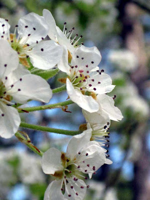
Another original.

Using poster edges.

And using the sponge filter. For these flowers, I prefer the sponge filter, and the painterly effect.

Sunday, April 11, 2010

Purple House


This colorful house is located in Morehead City. I've been wanting to take pictures of it for quite a while. For one thing, purple is my favorite color, and you don't see too many intense purple houses!

I cropped this section of the photo to use. My Photoshop technique this week is "poster edges." I've used this filter many times before but often wasn't happy with the results. Reading the book, I found that I had the settings set in a way that gave too intense of an effect.

This particular author (Lee Frost, The A-Z of Creative Digital Photography) feels that the filter "poster edges" works best on simple, graphic images, which was why I was out and about taking picture of buildings. The above image shows the filter at a low setting, giving what I feel is a "gentle" effect.

This photo shows the effect at a higher setting - lots more lines in the picture.

For my last photo, I used my buddy, the "sponge filter," to give the image a watercolor effect. For this house, my favorite result is the first one - I like the minimal definition added to the image. Any opinions?