Showing posts with label Photo Art Friday. Show all posts

Tuesday, November 13, 2012

Dreaming


A cyber friend, Linda Kittmer, like me, participates in Texture Tuesday and Photo Art Friday.  This week she combined both challenges into one image (see here) and I decided to follow her example and do the same.  The challenge for Photo Art Friday was to digitally enhance a still life.  The theme this week for Texture Tuesday was to add texture to an image related to "dream."  Here's the image I began with:

 
This still life is in one section of this bookcase:
 
 
Working with my still life image, I first added one of Bonnie's textures (Photo Art Friday) called Ancient Treasures.  I used soft light at 85%.  Then I used a Photoshop filter called Cutout, at 45%, to make it look more like an illustration than a photograph.  A bit of Brightness/Contrast enhancement and I had this:
 
 
The image was darker than I wanted, so I next went to Kim's textures (Texture Tuesday) and selected an appropriate one for this theme called "Dream."  I applied the texture at soft light, 100%, and got my final image, which I'll show again here:


You can see some of the words that were part of the Dream texture.  And as far as the theme goes, this little hand-carved bird is dreaming of spreading his wings and flying away!

Thursday, September 13, 2012

Seven Words

It's been a while since I participated in Photo Art Friday, but this week's theme interested me:
 
This week you can use the prompt to compose a seven word sentence that describes your life or experience or process as an artist (be it a photographer, painter, mixed media artist, digital artists, whatever ...) and marry your sentence to a piece of photo art that somehow illustrates your sentence.
 
This must be my favorite picture of myself - it keeps showing up in my art!  I didn't think long before "Art opens my eyes to the world" popped into my head.  Below are the two photos I used to build my image:
 
Lighthouse along the Portuguese coast, taken from Tropic Moon's deck
Me, on the island of St. Maarten in the Caribbean, circa 1980
 

Thursday, July 26, 2012

Those Fish Really Get Around!


For Photo Art Friday this week, our theme is "improbable pairings."  I was going to post some pictures with my large stuffed gorilla, Big Louie, but the fish took over again.  I'm calling this image "Flying Fish."  I guess you could say, the gull is dreaming about his dinner.  My last post, Gone Fishin', made good use of these fish, if you'd like to see where they came from.  Here's the original photo of the seagull:


I used the fish picture as a texture layer.  I also used another texture I created that I call "Jade Stone."


I blended Jade Stone with Soft Light, 100%, and desaturated it to remove the color. 

Well, the fish swam their way into another picture!  This is what happens when a hurricane comes to the coast and the water gets too high....


Here's the original photo of the beach houses:


I did many, many things to this picture to get the above image, one of which was making the houses taller and thinner!  I used my Jade Stone texture in this image, as well as using Bonnie's Soft Light Overlay.

In case you don't feel like making your way to my previous post, here's the last improbable pairing:


GO, FISH!!

Friday, July 20, 2012

Photo Art Friday - Light


Today's challenge for Photo Art Friday - highlighting light in a photo.  I also used Bonnie's texture, Soft Light Overlay, and blended it at soft light 30%.  This photo of seagulls was taken at Atlantic Beach, North Carolina.

Wednesday, July 11, 2012

Photo Art Friday - Fencing


Our theme this week, for Photo Art Friday, is "fencing." 


My original photo is some orange construction fence that I saw near Bogue Sound (Morehead City, North Carolina). 


Hue/Saturation in Photoshop gave me these strange colors.


The next step was using the Gradient Map called Chrome.


Then, to get this image (that's also at the top of the page), I used Equalize, Mosaic Tiles, and Radial Blur.


Starting again with my original photo, and going in another direction, I used Gradient Map, Metal, to get this black and white effect.


Taking the previous image, I used Invert, and Curves, to get a more interesting black and white picture.  This was fun!  I do so love Photoshop....

Friday, July 6, 2012

English Harbor


This image is for Photo Art Friday.  Our theme this week is architecture.  The original photo was taken at English Harbor, on Antigua, an island in the Caribbean.


Above is the original scanned slide.

Thursday, June 21, 2012

Photo Art Friday - Vintage Texture

Final Image
This week's challenge was to create a piece of vintage photo art.  Bonnie, at Photo Art Friday, provided a lovely new texture called Vintage Craquelure.  (It's a free download, if anyone is interested.) 

Original Image


Above is the photo I started out with.  It was taken at Atlantic Beach, North Carolina. 

Intermediate Image


This was my intermediate version, which I liked quite a bit!  To get to this point, I took my original photo and added the Vintage Craquelure texture at Multiply 75%.  There wasn't any "sun" in the picture, so I used the filter, Render, Lens Flare, Brightness 50%, 35mm Prime.  I set the Lens Flare on the horizon.  I found the original color of the texture layer to be too pink, so this shade is the result of using:  Adjustments, Variations, "more yellow."  I flattened my layers and saved this image.

Final Image


To get to this final image, I made a duplicate layer of the previous image.  On the duplicate layer I used Adjustments, Equalize, set at Normal, 45%.  Then I flattened the layers and saved this image.  It's definitely more intense in color.  Which do you like the best? 

Friday, June 15, 2012

Negative Space

Mouse over to see "before" image


Wow - two blog posts in one day - someone check me for a fever!  Actually, this is for Photo Art Friday.  I dawdled so long last week that I wasn't in time to link my work.


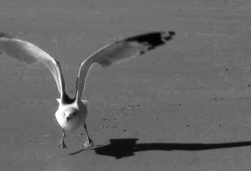
The suggestion for this week was a photo that included negative space.  Using the zoom feature on my camera, I had caught this fellow just as he was into "lift-off."  This is my original photo, and the one at the beginning of the post is my final image.  If you're interested in how I got there, read on:


Bonnie, and Kim from the Beyond Layers class, recommend doing more than hitting the Desaturation button when you're converting from color to black & white in Photoshop.  I started by converting to Grayscale mode, and then working to enhance the image.


My next step was to use the filter, Stylize, Find Edges, which I set at multiply blend mode, 30%.  It added a bit of an outline to the gull, but it wasn't showing that much of a difference, so I moved on....


For this step, I used Bonnie's (free) texture called Nitty Gritty.  I blended it with Soft Light at 100% opacity.  You can mostly see the effect of the texture in the sand.


This time I used Gradient Map (special effects, 2nd from the left), at Normal, 10% opacity.  Finally, I was seeing something interesting!  (This is the gradient map I was using when I did my "haunted house" in a previous post.


My last step was to use Brightness/Contrast, at +10 each, to give the image of final wee "pop."  This is the same picture that appears at the top of the post.  And, as I said to myself, enough already!

Sunday, June 10, 2012

Where the Ghosts Live....


This picture is my strange result for the Photo Art Friday challenge.  I started with the same photo I used in my last post: 


There were a couple of suggestions - 1) Do something in black and white, and 2) use the "gradient map" feature in Photoshop.  I ended up doing some of both.  It was the first time I'd used the gradient map, and I love the results that you can achieve with it.  Obviously, I cropped a lot from my original photo before I worked on it.  I decided not to go totally black and white because I like the effect of letting a little color remain in the image.  The result I got made me think of a haunted house - definitely a hangout for the ghosts!