Tuesday, June 26, 2012

Flower for Texture Tuesday


Today's theme was to use a photograph of a flower and add some of Kim Klassen's textures to the image.  Here's the original photo:


Processing:
Added "Reverie" texture, Hard Light, 80%
     Erased texture layer over flowers, 100%
Added "Flourish" texture, Multiply 75%
     Erased texture layer over flowers using 50% brush
Again added "Reverie" texture, this time Soft Light 75%
Flattened, and added text
Used Adjust, Posterize at 12

This flower stalk is next to our house.  I probably shouldn't even show this picture, but here you can see what a lonely flower it is!  I don't know where it came from - I don't think my husband ever planted it.  I don't do any yard work.  Oh, you already guessed that....


I also don't know what kind of flower it is.  Does anyone know its name?

Saturday, June 23, 2012

Burgers


I went for a walk at the Newport Flea Mall this morning and this sign caught my eye.  I've played with the photo in Photoshop, and done a variety of things to it (okay, I lost track of whatall I did...), including adding a vintage texture.


Here it is in sepia.


And this is the original photograph.


I took a fair number of photos, and didn't buy anything - a successful outing!

Thursday, June 21, 2012

Photo Art Friday - Vintage Texture

Final Image
This week's challenge was to create a piece of vintage photo art.  Bonnie, at Photo Art Friday, provided a lovely new texture called Vintage Craquelure.  (It's a free download, if anyone is interested.) 

Original Image


Above is the photo I started out with.  It was taken at Atlantic Beach, North Carolina. 

Intermediate Image


This was my intermediate version, which I liked quite a bit!  To get to this point, I took my original photo and added the Vintage Craquelure texture at Multiply 75%.  There wasn't any "sun" in the picture, so I used the filter, Render, Lens Flare, Brightness 50%, 35mm Prime.  I set the Lens Flare on the horizon.  I found the original color of the texture layer to be too pink, so this shade is the result of using:  Adjustments, Variations, "more yellow."  I flattened my layers and saved this image.

Final Image


To get to this final image, I made a duplicate layer of the previous image.  On the duplicate layer I used Adjustments, Equalize, set at Normal, 45%.  Then I flattened the layers and saved this image.  It's definitely more intense in color.  Which do you like the best? 

The Color Blue

Blue Norway (digital art from an ancient photo)


Today's color for Beyond Layers is blue.  I thought I'd post a few of my favorite blue images.  The first image was done in Photoshop.  I found the original photo in an album that had belonged to my father-in-law.  From what I could interpret, the photo was taken in Norway in the mid-1920's.  Here's the original:

Norway, 1920's ??


A few other examples of my digital art:

Blue Jellyfish  (photo I took at the North Carolina Aquarium)


*****

Aqua Fog (photo taken on a foggy day)


*****

Blue Bottle (original photo taken at a museum)


And that's it for Blue Thursday!  Do you have a favorite?

P.S.  These images are all available for sale in the form of ACEO's (2-1/2" x 3-1/2") in my Etsy shop.  Look to the right (up near the top).  I decided to post these as my featured items in my Etsy shop, to go with today's blog post.  Truly, it doesn't take much to amuse me....

Wednesday, June 20, 2012

Pink Flamingos


Our color today in Beyond Layers is pink, so I thought I'd post a selection of flamingo pictures.  These were taken at the North Carolina Zoological Park.  Such beautiful birds!


*****


*****


*****


Tuesday, June 19, 2012

The Color Yellow


The bear is the symbol for New Bern, North Carolina.  A few years back, they had a bear painting contest.  This yellow bear was one of my favorites.  I felt he would do a fine job representing the color yellow today.


One of his friends, the Monopoly bear.


Abour half of the bears stood upright.  This one represents the early days of New Bern, when it was the first capital of North Carolina.


And it wasn't just bears!  New Bern has some interesting painted fire hydrants, too!

Monday, June 18, 2012

The Color Green


An assignment for the Beyond Layers class - Monday - the color green.  I took this picture in my backyard.

Friday, June 15, 2012

Negative Space

Mouse over to see "before" image


Wow - two blog posts in one day - someone check me for a fever!  Actually, this is for Photo Art Friday.  I dawdled so long last week that I wasn't in time to link my work.


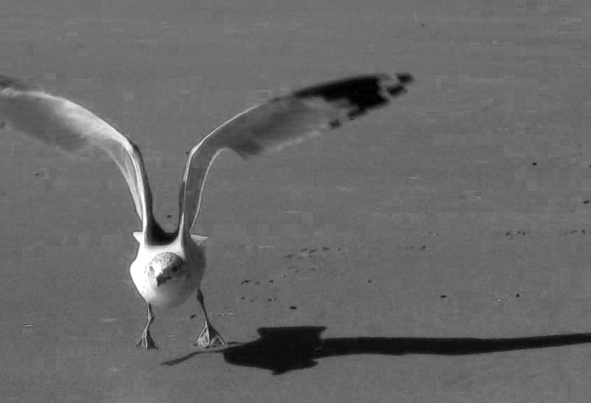
The suggestion for this week was a photo that included negative space.  Using the zoom feature on my camera, I had caught this fellow just as he was into "lift-off."  This is my original photo, and the one at the beginning of the post is my final image.  If you're interested in how I got there, read on:


Bonnie, and Kim from the Beyond Layers class, recommend doing more than hitting the Desaturation button when you're converting from color to black & white in Photoshop.  I started by converting to Grayscale mode, and then working to enhance the image.


My next step was to use the filter, Stylize, Find Edges, which I set at multiply blend mode, 30%.  It added a bit of an outline to the gull, but it wasn't showing that much of a difference, so I moved on....


For this step, I used Bonnie's (free) texture called Nitty Gritty.  I blended it with Soft Light at 100% opacity.  You can mostly see the effect of the texture in the sand.


This time I used Gradient Map (special effects, 2nd from the left), at Normal, 10% opacity.  Finally, I was seeing something interesting!  (This is the gradient map I was using when I did my "haunted house" in a previous post.


My last step was to use Brightness/Contrast, at +10 each, to give the image of final wee "pop."  This is the same picture that appears at the top of the post.  And, as I said to myself, enough already!

More Photos in Black & White


For today's assignment in Beyond Layers, I worked on a couple of slides that I'd taken when we were in Turkey many years ago.  Above is my black & white version and below is the original photo in color.


These were some of the traditional Turkish yachts that were being used as charter boats.  We shared an anchorage with them one night.


This is a waterfront in Turkey.  Below is the original version.


Someday I want to paint this picture on a large canvas.  We'll see if that ever happens!  :o)

Tuesday, June 12, 2012

Black & White Techniques

Grayscale, then Fresco filter, Multiply, 50%


I was converting some of my photos to black and white images.  Here's the closest I have to the original photo:


Next, I tried black and white effects on a picture of a farm building. 

Cropped, Grayscale, then adjusted Levels


Again, this is the closest I have to the original photo:


The tendency, when going from a color image, to black and white, is to use the "desaturate" feature.  Actually, I believe that going to Adjustment, Mode, Grayscale, gives a truer black and white effect.  Here's my third effort:

Cropped, Grayscale, then used Poster Edges Filter at 75%


Here's the original photograph, taken at Fort Macon, Atlantic Beach, North Carolina.


This assignment was done for my Beyond Layers class. 

Sunday, June 10, 2012

Where the Ghosts Live....


This picture is my strange result for the Photo Art Friday challenge.  I started with the same photo I used in my last post: 


There were a couple of suggestions - 1) Do something in black and white, and 2) use the "gradient map" feature in Photoshop.  I ended up doing some of both.  It was the first time I'd used the gradient map, and I love the results that you can achieve with it.  Obviously, I cropped a lot from my original photo before I worked on it.  I decided not to go totally black and white because I like the effect of letting a little color remain in the image.  The result I got made me think of a haunted house - definitely a hangout for the ghosts!

Thursday, June 7, 2012

Whispers of the Past

Mouse over to see original photo


Today's assignment in Beyond Layers was to work with the word "whisper."  That meant coming up with something soft and delicate - not my usual type of work!  Kim also provided two new textures for us to work with. 

This photo was taken in Beaufort, North Carolina.  At one time this building was a school/academy.  I think it's a private home now.  My original photo was way too intense in color, so I used Kim's "flourish" texture twice and "the veil" texture once.  I did a lens flare layer, based on Kim's instructions, and adjusted "levels" to get the dreamy/hazy atmosphere.  On most layers, I erased the layer where it covered the flowers so that I could keep most of the color in the flowers.  Here's the original photo:


Saturday, June 2, 2012

A Touch of Color


An assignment this past week in the Beyond Layers class involved taking a photo, duplicating the photo, and turning the new layer to black and white.  After that, we were to select one part of the picture - in this case I selected the life buoy - and erase the new black and white layer where it covered the life buoy.  This left just a bit of color in an otherwise black and white photo.  This photo was taken a couple years ago in Maine.


In full color.


That potato chip thing - I couldn't stop with just one photo.  This picture was taken at Atlantic Beach, North Carolina.  There were several people out flying kites that particular day.


In full color.


Lastly, the photo of the roadside shrine in Ventotene, Italy, that I blogged about the other day.